FINDING NORMA
Chrissie Berridge explains how she came up with the design for Heber’s 2019 major production

I designed the poster for Heber Opera’s Rusalka in 2015 and have continued for each major production, plus their concert performances. I have developed a good eye for layout thanks to my time working in the publishing industry. For 14 years I was the editor for The Dolls’ House magazine. Creating a front cover design for the magazine was very similar to creating a poster for a musical production - working with images and words to both engage attention and get results!
Preparing for Heber Opera’s 2019’s production of Bellini’s opera, Norma, directors Dorothy and Michael Withers already had some ideas about how the poster should look. In an email they explained that they were after an ethereal image, maybe with Celtic and Roman references, possibly some blood (it is a tragedy after all). My design needed to interpret their vision.
Image and words
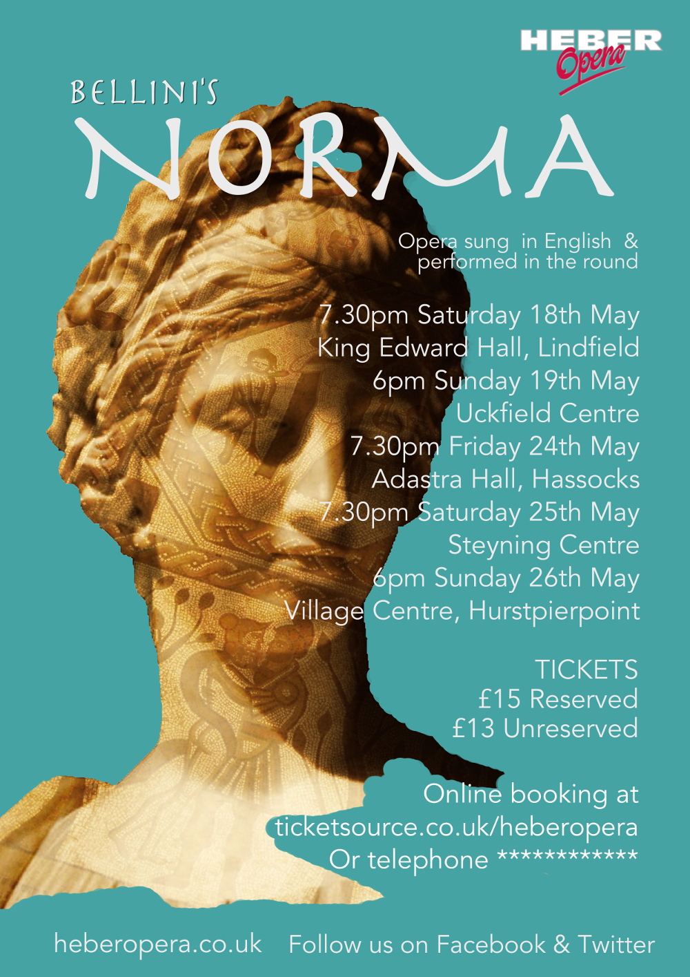
My starting point was to find the main image, the choice of which for any poster is crucial. It has to be striking enough to draw the eye, but not so complicated that positioned text is obscured or can't be read. I began by looking though my portfolio of photographs. Amongst these I found a classical statue of a female head that I thought might be a contender. I experimented with the image, overlaying it with a photograph of a Roman mosaic, positioning it in a plain background. I thought about the ‘blood’ element, but decided against it as I’d already referenced it in 2018’s Rigoletto. I wanted the Norma poster to be suitably distinct from previous productions.
 |
| An early idea using a classical statue with a mosaic overlay |
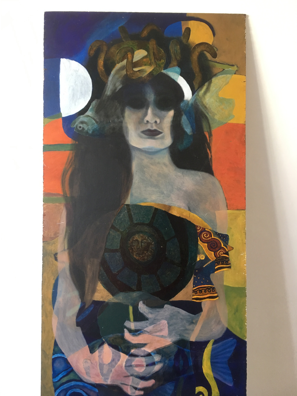
Looking for an alternative I chose a painting by my sister, Paula Wrightson. Over the years Paula has produced a large body of work both painted and photographs. One painting in particular was of a confident Medusa-haired woman draped in a garment with stylised banding. I knew that the snake hair wouldn’t be appropriate but the rest of the picture had potential.
 |
| The original Medusa painting by Paula Wrightson |
Aside from the main image and title the Norma poster had to include information on dates, venues, prices and booking details, Heber’s logo, plus those all important social media contacts. These can be positioned on top, underneath or to the side of the base image. The font and point size make a difference too. So I spent a lot of time working on all these elements to find a best fit with each of my chosen images. It was then down to Dorothy and Michael for their thoughts on my initial designs.
The eyes have it!
After considering the designs, I was asked to concentrate on the portrait and discard the statue. One of the problems though with the painting was the dark eye area. They looked too dark without any real definition, could I rectify this? Back at my computer I played around with the eye area, working with a second image of real eyes overlaid and blended in to add clarity.
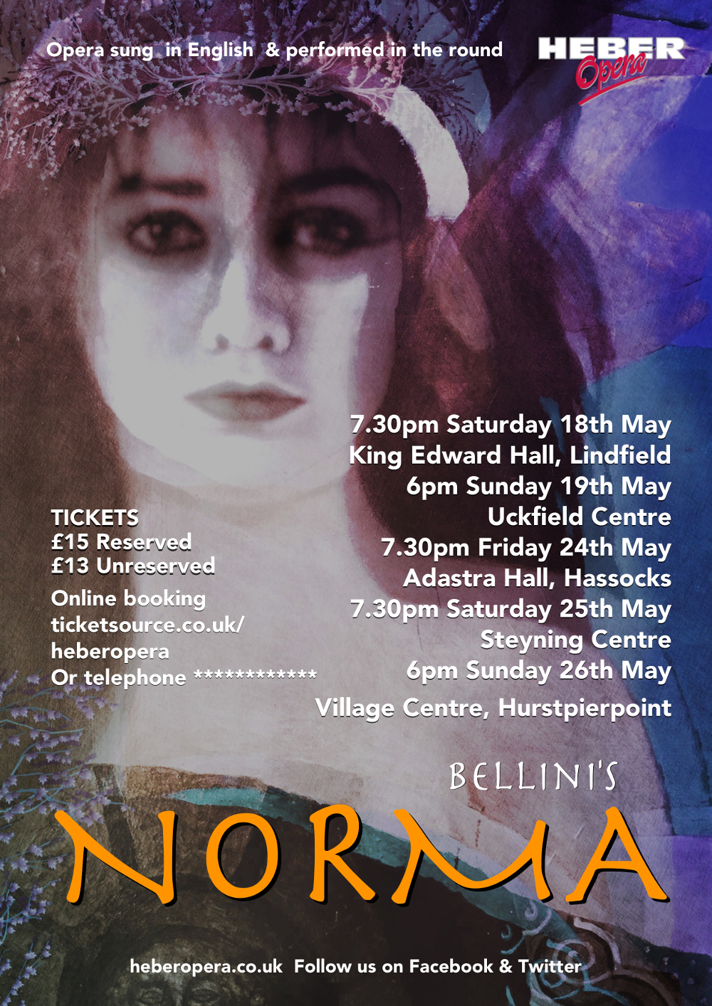
Following a conversation with Paula about my poster designs she sent me a photograph of herself, wearing an ivy circlet. It looked akin to an inspirational image that Dorothy had sent alongside her initial feedback. The photograph had been taken around the same time that the original Medusa was painted. The new image had clear eye contact with the viewer and was certainly ethereal. Could this photo replace the painting in a revised design?
I created a new interpretation using the text as already laid out. The new photo looked great, with a strong image and clear text, but there was a niggling doubt in my head. Would the audience expect to see this woman (Paula) as ‘Norma’ in our production? I didn’t want the image to be misleading. I knew that I had to go back to the Medusa painting and those troublesome eyes.
 |
| Experimenting with the eye area and altering the colours of the painting |
Result
Suddenly I had an idea - rather than try and make the eyes fit the design, I decided to avoid them altogether. I cropped the image further and there she was – Norma! By ignoring the eyes, the focus transferred to the lips. As a viewer we are waiting for those lips to open – the woman’s story to be revealed, just as it will be in the opera. Not seeing the whole face retained an air of mystery about the woman herself. With the added bonus of highlighting the stylised Celtic banding on the cloth and the Roman shield motif, the design was in the bag!


